Responsive Web Design – What It Is And How Does Work

Responsive Web Design
The Internet took off faster than anyone would have predicted, growing like crazy. Now, for the past few years, mobile growth has exploded onto the scene. The growth of mobile Internet usage is also far outpacing that of general Internet usage growth. These days it is hard to find someone who doesn’t own a mobile device, or multiple, connected to the Internet.
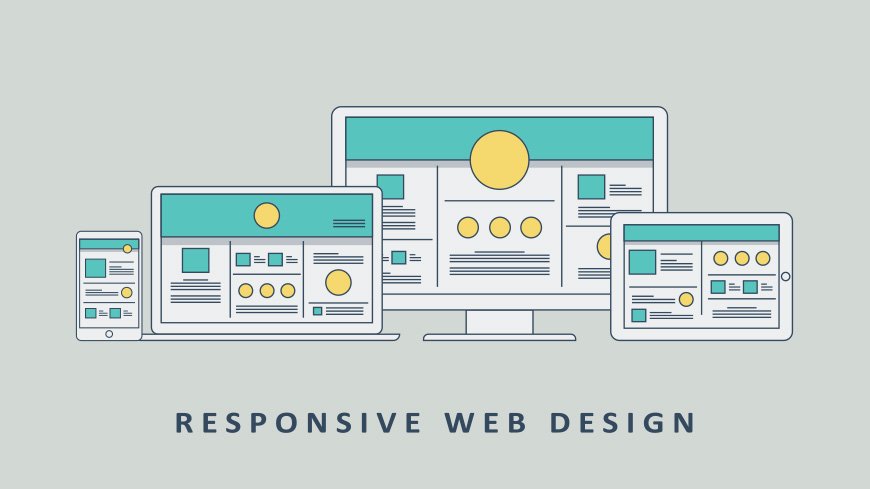
With the growth in mobile Internet, usage comes the question of how to developed websites suitable for all users. The industry response to this question has become a responsive web design, also known as RWD.
Responsive web design is a style whereby a designer develop a web page that “responds to” or resizes itself depending on the type of device it is being seen through. That could be an oversized desktop computer monitor, a laptop or devices with small screens such as smartphones and tablets. Using HTML and CSS to automatically resize, hide, shrink, or enlarge, a website, to make it look good on all devices (desktops, tablets and phones)
How Does Responsive Web Design Work?
Responsive web design is broken down into three main components-
- The site must be built with a flexible grid foundation (Flexible Layouts).
- Images that are incorporated into the design must be flexible themselves.
- Different views must be enabled in different contexts via media queries.
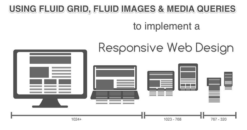
It is important to note that all three features need to be implemented in order for a truly responsive web design to take place.
Flexible Layouts
Responsive web design is broken down into three main components, including flexible layouts, media queries, and flexible media. The first part, flexible layouts, is the practice of building the layout of a website with a flexible grid, capable of dynamically resizing to any width. Flexible grids are built using relative length units, most commonly percentages or em units. These relative lengths are then used to declare common grid property values such as width, margin, or padding.
Flexible layouts do not advocate the use of fixed measurement units, such as pixels or inches. Reason being, the viewport height and width continually change from device to device. Website layouts need to adapt to this change and fixed values have too many constraints. Fortunately, Ethan pointed out an easy formula to help identify the proportions of a flexible layout using relative values.
The formula is based around taking the target width of an element and dividing it by the width of it’s parent element. The result is the relative width of the target element.
| target ÷ context = result |
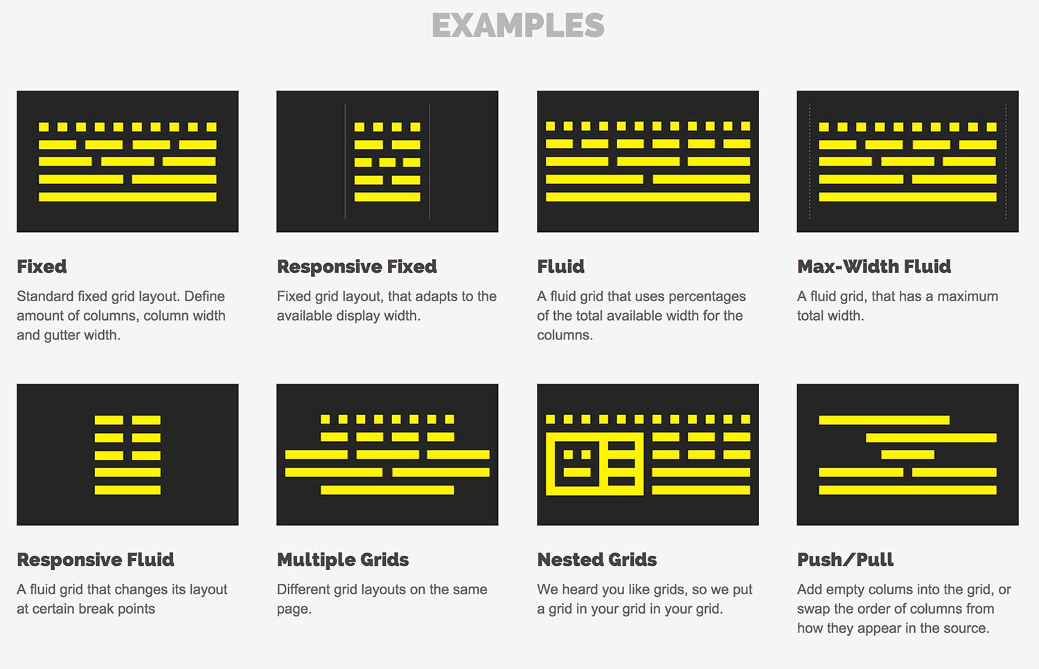
Flexible Grid
The term grid as it pertains to web design is getting murkier. Saying that your site must consist of a flexible grid does not mean that you are restricted to choosing from one of the dozen or so great grid systems out there.
Defining your own parameters for columns, spacing and containers is often the best solution for web design and can be just as flexible as any existing system out there.
In fact, most existing grid systems restrictively use CSS classes to define size, space and alignment. Trying to superimpose these limits onto a responsive web design can be tricky and more time-consuming compared to coding your own grid.
Whether you’re using a premade grid system or creating a custom solution, the truly important aspect of a flexible grid system is in the mechanics of your layout sizes and spacing.
For web designers, this means abandoning our beloved pixels and replacing them with web layouts that use percentages and em’s, which are relative units of measurement.
Of course, this doesn’t mean we stop working with pixels in our image-editing software (i.e. Photoshop, Fireworks, etc.). Instead, an added step that involves a little bit of (totally basic) math becomes a part of the web design process as we convert our pixels into web layouts that use a relative unit of measurement.
 Let’s see how this formula works inside of a two column layout. Below we have a parent division with the class of container wrapping both the section and aside elements. The goal is to have had the section on the left and the aside on the right, with equal margins between the two. Normally the markup and styles for this layout would look a bit like the following.
HTML
| <div class=”container”>
<section>…</section> <aside>…</aside> </div> |
CSS
| .container {
width: 538px; } .section, aside { margin: 10px; } .section { float: left; width: 340px; } .aside { float: right; width: 158px; } |
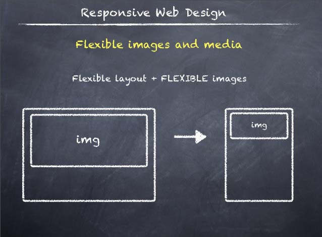
Flexible Images
Images that move and scale with our flexible grid is another key feature of responsive web design. Flexible images often give web designers a bit of a headache. Loading in huge, oversized images that we scale down using width and height HTML attributes when we want more space for text content on smaller browsing devices is not a good practice for faster web page load times.
Of course, how big of an issue this also depends on how image-heavy your site is. As web design evolves, we are constantly seeing sites that incorporate fewer and fewer unnecessary images and stock photos. Perhaps this is a good time to evaluate whether your web design needs to be as image-heavy as it currently is.
An alternative to scaling images is cropping them with CSS. The CSS overflow property (e.g. overflow: hidden) gives us the ability to crop images dynamically as the containers around them shift to fit new display environments.
We can also have multiple versions of the image on the server, and then dynamically serve the appropriately sized version depending on the user agent using server-side or client-side feature detection in tandem with DOM manipulation.
Finally we have the option to hide images altogether if we really want to put focus on the non-image content, using media queries that serve a stylesheet which sets the display: none property for images (or a subset of images by assigning optional images a class like optional-img to allow for greater CSS selector specificity in your stylesheet).
Media Queries
Media queries are arguably the most exciting (and most intimidating to web designers unfamiliar with them) feature of responsive web design.
Oftentimes, people get carried away with media queries, thinking of them as the core component of responsive design and leaving flexible page components optional. The reality of the situation is that media queries are hardly useful without the existing implementation of a rock-solid HTML and CSS foundation that includes not only a flexible grid but flexible images as well.
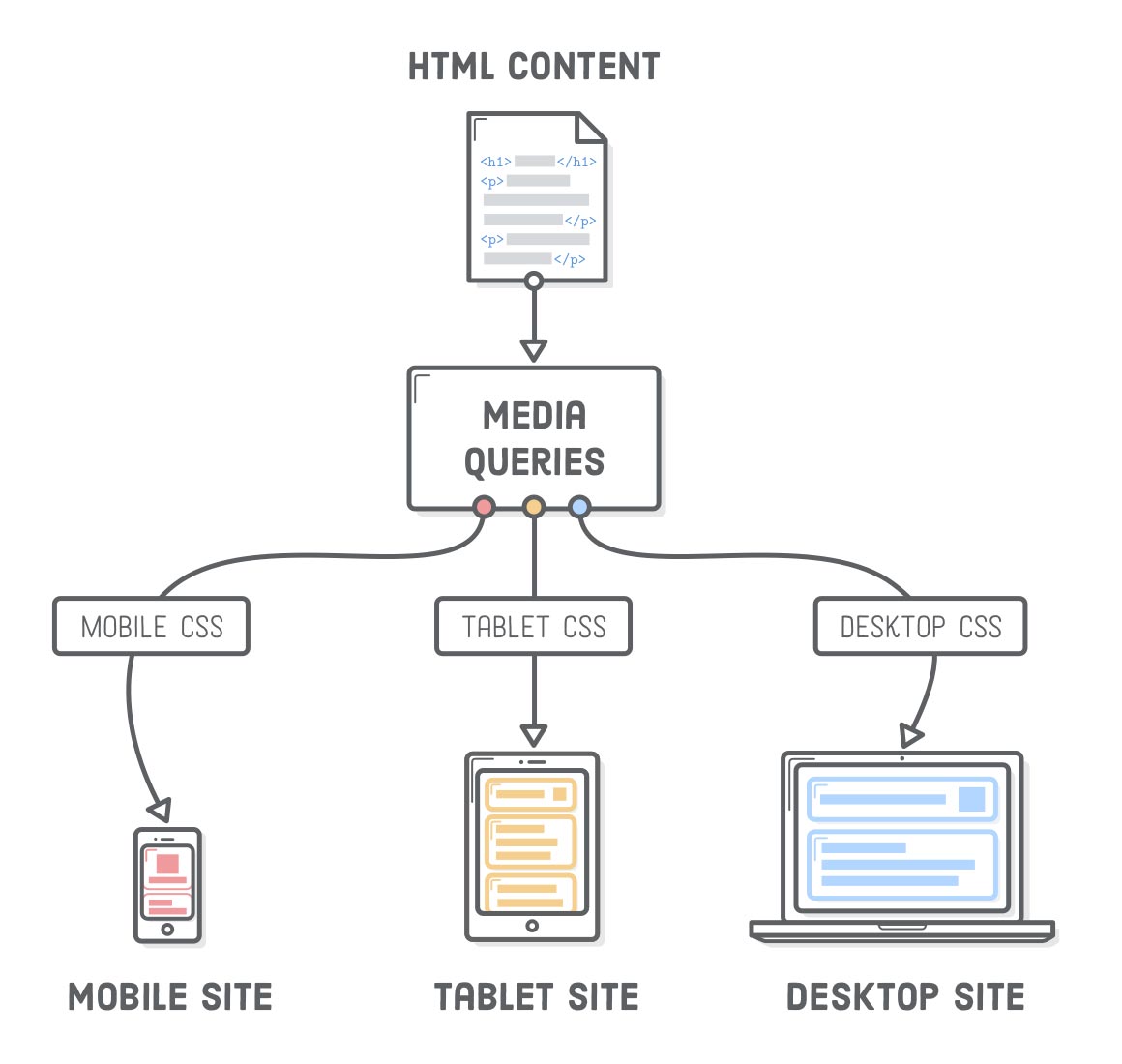
Media queries allow designers to build multiple layouts using the same HTML documents by selectively serving stylesheets based on the user agent’s features, such as the browser window’s size. Other parameters are orientation (landscape or portrait), screen resolution, colour (i.e. how much colour the screen can render), and so on.
Here is an example of media queries that serve a stylesheet depending on the width of the viewport:
| <link rel=”stylesheet” media=”(max-device-width: 320px)” href=”mobile.css” />
<link rel=”stylesheet” media=”(min-width: 1600px)” href=”widescreen.css” /> |
Media queries are not specifically a mobile solution or a tablet solution (though they’re often associated with them as such). Instead, media queries and responsive design allow us to think outside of the constraints of screen size or resolution and start building websites that flexibly adapts to (theoretically) all the different mediums.
Related Issues
Mouse v. touch: Designing for mobile devices also brings up the issue of mouse versus touch. On desktop computers, the user normally has a mouse to navigate and select items. On a smartphone or tablet, the user mostly is using fingers and touching the screen. What may seem easy to select with a mouse, may be hard to select with a finger on a tiny spot on a screen. The Web designer must take “touch” into consideration.
Graphics and download speed: Also, there’s the issue of graphics, ads and download speed. On mobile devices, it may be wise to display fewer graphics than for desktop views so that a site doesn’t take forever to load on a smartphone. Larger ad sizes may need to be exchanged for smaller ads.
Apps and “mobile versions”: In the past, you might have thought about creating an app for your website — say an iPad app or an Android app. Or you would have a mobile version specifically for BlackBerry.
But with so many different devices today, it’s getting harder to create apps and different versions for every device and operating platform.
As we look over the three features of responsive web designs, there really should be very little to be excited about. The truth is that 90% of what makes up a responsive web design is simply good web design, to begin with. Well-formed HTML and a flexible layout should be a part of the daily digest for the modern web designer. In a modern context, given that the need for flexible layouts is even more imperative now so that we can better accommodate the wider array of browsing situations currently in existence, we need designs that are fluid and flexible.
Recommended Posts

Guide to Develop Your First WordPress Theme
June 14, 2019

Essential Tools For Frontend Web Development
February 25, 2019

Your Website Is a Dynamic Part of The Digital Marketing
November 19, 2017

Education Management System
for School, College & University
Take your educational institutes to the next level